A compressed postscript file of this document (60K) can be obtained by clicking here.
Visualisation of Radio Data
Tom Oosterloo
Australia Telescope National Facility
Abstract
Radio astronomy software has not quite kept up with recent developments for display of and interaction with data. At the Australia Telescope National Facility we are trying to catch up by investigating how useful visualisation techniques and approaches like visual computing are for the reduction of radio data. I will discuss a few techniques that we applied to radio data and comment briefly on their merit.
subject headings: Techniques: image processing -- Methods: data analysis
The emergence of workstations has had, and still has, important consequences for the structure of data analysis software. Workstations are cheap and fast, have very good display capabilities and the development of window environments like X11 enables one to interact with a computer in an entirely new way. These capabilities have led to new kinds of user interfaces and new ways of displaying data. Visual computing and data visualisation as available in commercial packages like AVS or BOB, are important examples. These new techniques enable scientists to look at and analyse data in new ways, helping them to get more science out of their data.
However, in astronomy, and most notably radio astronomy, development in these
areas has been relatively slow. In radio astronomy, the main data reduction
packages like AIPS and GIPSY have been ported to the new environment of
workstations, but the way these workstations are used is basically the same as
the way the old machines were used. For example, GIPSY used to run on a VAX and used
an I ![]() S model M70 image computer for the display. Now GIPSY runs on
workstations, but for the display the only change has been that the data can
now be displayed in a window rather than on the image computer. The
functionality of the display is basically the same. For AIPS the situation is
similar. There are, of course, good reasons why this happened: those who
maintain GIPSY do not have the resources to do anything more sophisticated,
while for AIPS most of the resources are directed towards the development of
AIPS++ instead of towards adding new features to AIPS. This is an important
step that will bear fruit in the long run, but in the meantime there has been
little development of new techniques for data display in AIPS.
S model M70 image computer for the display. Now GIPSY runs on
workstations, but for the display the only change has been that the data can
now be displayed in a window rather than on the image computer. The
functionality of the display is basically the same. For AIPS the situation is
similar. There are, of course, good reasons why this happened: those who
maintain GIPSY do not have the resources to do anything more sophisticated,
while for AIPS most of the resources are directed towards the development of
AIPS++ instead of towards adding new features to AIPS. This is an important
step that will bear fruit in the long run, but in the meantime there has been
little development of new techniques for data display in AIPS.
At the Australia Telescope National Facility (ATNF) we are trying to contribute to remedying this situation. Our idea is to apply new techniques used in other areas for data display and user-interaction, to problems dealing with the analysis of radio data, in particular spectral radio data. Our aim is to see which techniques can be useful for astronomy and then write appropriate software for astronomers. In the following, I will briefly discuss first how visualisation techniques like volume rendering can be applied, then describe briefly our efforts at interactive modelling of data sets.
Spectral observations with a radio telescope like the Australia Telescope Compact Array result in a set of quasi-monochromatic images (channels) over a range of frequencies of a small part of the sky. Such a three-dimensional data set is commonly referred to as a data-cube, having two spatial axes (right ascension and declination), while the third axis corresponds to velocity . The standard way of displaying this data cube is as a movie: the channels are displayed in a sequence. In this way we can get a perception of how the emission is distributed in the different channels and can build up an idea of the structure of the emission in the cube. The problem with this technique is that if there are many channels, it is difficult to understand the spatial relationship between all the channels.
However, instead of considering the data as a sequence of images, one can think of the data cube as a real cube: a three-dimensional matrix of data with the data displayed as if they contained a three-dimensional object. In areas like medicine, displaying three-dimensional data is now a standard technique and we have applied some of these techniques to radio data. This works as follows. Imagine the three-dimensional matrix as floating in space and having a certain orientation, not necessarily aligned with the principal axes. Then, from each pixel of the display a ray is shot through this matrix and every voxel (visualisation speak for volume element) that is hit by this ray contributes in some way to the intensity and colour of the display pixel. The voxel can contribute in many ways. A simple algorithm is to add the values of all the voxels on a ray (in which case the images displayed will simply be the projection of the data cube onto the screen); another simple algorithm would select the maximum value on the ray. These algorithms have the advantage of being relatively fast while still displaying the data reasonably well.
There are other interesting possibilities. For example, as seen from the display pixel, a voxel along a ray is behind other voxels, making it possible to let a voxel partly obscure the voxels that are behind it. Or in other words, we can assign, as well as an intensity or a colour, an opacity to the voxel. Along the ray, we now have to solve an equation of radiative transfer, as if the voxels in the data cube represented a gas cloud. We refer to algorithms of this kind as hot gas algorithms. The advantage of doing this calculation for display purposes only is that we do not have to choose the opacities according to some physical law. The radiative transfer that we use is as follows:
![]()
where ![]() is the opacity of voxel i and
is the opacity of voxel i and ![]() the intensity of this voxel.
the intensity of this voxel.
![]() is the solution based on the voxels behind voxel i, and
is the solution based on the voxels behind voxel i, and ![]() is
the sum after this voxel is added. The above calculation is done
back-to-front, so that voxels in the back of the cube are obscured by voxels in
the front. Based on the value of a voxel, we assign a red, green and blue
value to this voxel, and we do this calculation for the three colours
separately.
is
the sum after this voxel is added. The above calculation is done
back-to-front, so that voxels in the back of the cube are obscured by voxels in
the front. Based on the value of a voxel, we assign a red, green and blue
value to this voxel, and we do this calculation for the three colours
separately.
When we first implemented this algorithm, we divided the value range of the data in eight subranges and assigned a colour and opacity to each subrange. This kind of algorithm is commonly applied in medicine where, for example, tissue and bone are differently colour-coded. However, images calculated in this way give a schematic representation of the data and, because of this this, the method has limited application for radio data. But if, for example, one wants to distinguish emission from absorption, the method can be quite useful. Its main disadvantage is that there are many parameters the user has to specify (the colour, the opacity and the value range for each subrange) that make it quite user-unfriendly.
What gives better results is to couple the opacity, through a simple functional
form, to the intensity of a voxel. A choice we have found useful is ![]() , where
, where ![]() is a param
eter that the user can specify. One
advantage here is that the user has to control only one parameter. The images
made with this new algorithm look more natural and the parameter
is a param
eter that the user can specify. One
advantage here is that the user has to control only one parameter. The images
made with this new algorithm look more natural and the parameter ![]() gives
the user good control over what he/she sees. For example, if
gives
the user good control over what he/she sees. For example, if ![]() is taken
to be 1/2, voxels with values just above the noise level are already quite
opaque and we see mainly the surface of the region where there is emission in
the data cube. But if we use
is taken
to be 1/2, voxels with values just above the noise level are already quite
opaque and we see mainly the surface of the region where there is emission in
the data cube. But if we use ![]() , only the brightest voxels will be
visible and the object will appear quite transparent. Therefore
, only the brightest voxels will be
visible and the object will appear quite transparent. Therefore ![]() can
be used to 'zoom in' on parts of the data cube.
can
be used to 'zoom in' on parts of the data cube.
There are, however, some general drawbacks to this volume rendering. First, a normal workstation is still not quite fast enough to do it in real-time. In our implementation, it takes a few seconds to compute an image. This means that the rendering is not really interactive in the sense that we cannot rotate the cube at will and see the result immediately.
Second, there also seems to be a perception problem. Objects that the user is familiar with, like the skull of human being, can be reproduced in a very rough way, and the brain will still recognise the scene. We have found that for radio data cubes this is not the case. The calculated image often appears as just a coloured blob on the screen. Even if we try things like surface shading to enhance the three-dimensional perception, the effect is sometimes still poor. The main problem is that the brain does not perceive the structure of an object just by looking at a three-dimensional representation of it, because it does not recognise it. This may get better with time, as astronomers gain experience, but part of the problem will remain since one of the reasons to observe objects is that we do not know what they look like! What helps is to calculate a number of images where the cube is rotated over a small angle in between, and later play these images as a movie. In this way we see the object rotating (this can be fast because now only precomputed images are displayed) and we get a much better three-dimensional perception of the emission in the cube.
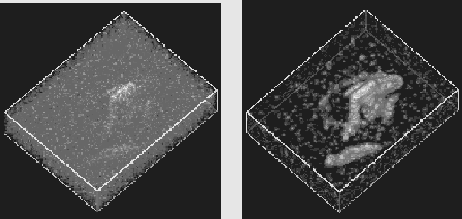
Figure 1. left: Volume rendering of a data cube from HI observations of an interacting pair of galaxies (data from Rand and van der Hulst, 1993). The shortest axis in the figure is the velocity axis of the cube, while the other two axes are right ascenscion (running bottom left-top right) and declination (top left - bottom right). Only the brightest emission is visible through the fog of the noise. right: Volume rendering of the same data, after adaptive filtering, using the same settings for the opacities as for the left figure. Now the two galaxies and several tidal tails are clearly visible
Another problem is that because the data cube is treated as a three-dimensional object, unwanted features (like noise) can hide the emission we want to see. To see faint emission in the cube, the opacities must be adjusted in such a way to make it clearly visible. However, this also means that the noise in front of the object also becomes more visible and we get a clouded view. Here we have found that adaptive filtering can be very useful. Those parts of the data cube that have only noise are smoothed heavily, while the brighter parts are left untouched. Voxels that are not so bright get a treatment in between. This greatly improves the 'visibility' of faint emission in the cube and should be regarded as a necessary tool for volume rendering in radio astronomy, or for noisy data in general. A good example of the use of adaptive filtering is given in Figure 1.
Despite the problems described above, we have found volume rendering to be a useful tool. It gives a very good global view of the data. In cases like those shown in Figure 1, where we have an HI observation of two interacting galaxies in which the HI morphology is quite distorted, we get a much better understanding of the kinematics of the gas and how various components are related. We also found that errors in the continuum subtraction, as well as residuals due to incomplete image restoration, show up very clearly with volume rendering because we can see systematic structures much better, especially if they have low amplitude. Therefore, volume rendering is not only useful in the final analysis of data cubes, but also for checking intermediate steps in the data reduction.
Windowing software enables us to interact with data and programs in a much more sophisticated way. For example, actions in one window, like clicking a mouse or dragging a line to another place, can have reactions in many other windows. In this way we can have a much more intuitive control of the program which, in turn, can be very useful for interactive modelling. A software infrastructure for this has been developed at the ATNF which the astronomers now use successfully.
It can be important to model data cubes in three dimensions. When modelling spiral galaxies for example, it is customary first to construct a two-dimensional velocity field from the data cube and then derive a model from this velocity field (e.g. Begeman, 1987). In contructing this 2D velocity field, much information is lost, most importantly the shape of the velocity profile in every position. When modelling such data in three dimensions, this information is still available.
But we have also another reason for making this modelling software. If astronomers have an interactive tool for making model cubes, they can build up experience of how models look in three dimensions. This may help to overcome the perception problem mentioned in the previous section. Also, it can be very instructive to play with a model in an interactive way.
The basic idea behind our modelling software is that the modelling should not be done by one program, but by a group of programs that communicate with each other. One program computes a model data cube. This program gets its input from other programs, e.g. a graphics program where the user can change the shape of a graph of model parameters with the mouse. Another program displays the observed data cube together with the model data cube and the user can judge how well the model describes the data. This modular setup has the advantage that we can develop separate display programs (like volume rendering) that can be inserted into all the modelling software. Also, modules that require large resources can be run on a larger or faster machine while, for example, the display module can run on a local workstation.
We have applied these ideas to a number of modelling problems, e.g. deriving the rotation curve of a spiral galaxy. Unfortunately the power of these programs cannot be demonstrated in a written paper, but the response of astronomers using our software has been positive. The computation of the model cubes takes a few seconds. This is perhaps not as fast as we would like, but our experience with this software tells us that it can be a very important tool for a better understanding of the data.
A new development being investigated is stereoscopic display of data cubes. Hardware for this is now relatively cheap and the volume-rendering software that we have is easily adaptable to it. If we manage to get a good 3D representation of data cubes using stereoscopic display, we could start thinking about interactively selecting subregions from the data cube using this 3D display. In this way the rendering software could become part of the analysis software similar to the way that the 2D displays are now.
Another topic that we will look at is Fourier rendering. By using the
slice/projection theorem, which says that the Fourier transform of a projection
of a three-dimensional data set can be obtained simply by sampling the Fourier
transform of this data set along a certain plane, volume rendering can be
reduced from a three-dimensional to a two-dimensional problem. For
cubes above a certain size, this should speed up the rendering considerably
(perhaps by a factor of 10). This could be a major step towards interactive
rendering.
Acknowledgements.
The software referred to in this paper I have developed together with
Richard Gooch. The input from Ray Norris was very valuable.
References
Begeman, K.G., 1987, Doctoral Dissertation, University of Groningen
Rand. R., & van der Hulst, J.M. 1993, AJ, 105, 2098