The Hertzsprung-Russell Diagram
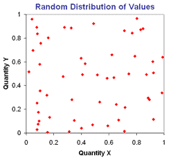
Graphing or plotting data is an essential tool used by scientists. In attempting to make sense of data and see if two quantities are related we can plot them and seek trends. If we have a look at the two examples below the first shows two quantities, X and Y that an object may have. When they are plotted we can see that there is no discernable relationship between X and Y. In fact in this example there is no relationship, the data is purely random.
If we plot data for height versus mass for a small group of people, however, we see a very different pattern as shown below.
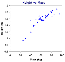
As we might expect, there does appear to be a correlation between the height of a person and their mass. In general, the taller a person is, the greater their mass but as with many other characteristics of humans there is a large variation. Some people are tall and skinny, others shorter but higher mass. There are, however, real physical limitations on both the height and mass of people. We do not expect to find a 3.5 m person with a mass of 10 kg or a 1.0 m person with a mass of 300 kg!
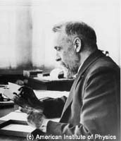
Credit: Dorritt Hoffleit, Yale University Observatory, courtesy AIP Emilio Segre Visual Archives
Ejnar Hertzsprung
|

Credit: AIP Emilio Segre Visual Archives, Margaret Russell Edmondson Collection
Henry Norris Russell
|
One of the most useful and powerful plots in astrophysics is the Hertzsprung-Russell diagram (hereafter called the H-R diagram). It originated in 1911 when the Danish astronomer, Ejnar Hertzsprung, plotted the absolute magnitude of stars against their colour (hence effective temperature). Independently in 1913 the American astronomer Henry Norris Russell used spectral class against absolute magnitude. Their resultant plots showed that the relationship between temperature and luminosity of a star was not random but instead appeared to fall into distinct groups. These are seen in the H-R diagram below. It has a few specific stars included in the plot but otherwise just shows the main regions.
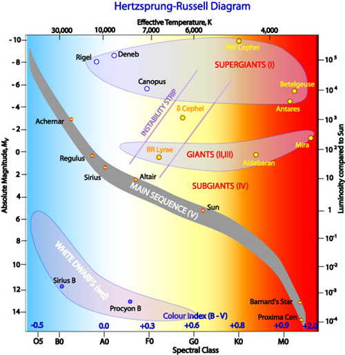
The majority of stars, including our Sun, are found along a region called the Main Sequence. Main Sequence stars vary widely in effective temperature but the hotter they are, the more luminous they are, hence the main sequence tends to follow a band going from the bottom right of the diagram to the top left. These stars are fusing hydrogen to helium in their cores. Stars spend the bulk of their existence as main sequence stars. Other major groups of stars found on the H-R diagram are the giants and supergiants; luminous stars that have evolved off the main sequence, and the white dwarfs. Whilst each of these types is discussed in detail in later pages we can use their positions on the H-R diagram to infer some of their properties.
Using the H-R Diagram to Infer Stellar Properties
Let us look at the cool M-class stars as an example. If we look at the H-R diagram below we can see that in fact there are three main groups of these stars.
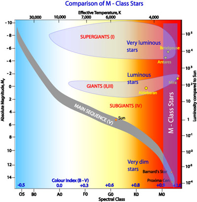
At the bottom-right of the diagram we can see two named stars, Proxima Centauri and Barnard's Star. These are both cool (approximately 2,500 K) and dim (absolute magnitudes of about 13, only about 1/10,000 the luminosity of our Sun). Following the broad band straight up we come across Mira, also cool but much more luminous. Travelling further up we come across Antares and Betelgeuse. Again these stars are cool but they are extremely luminous, almost 10,000× as luminous as the Sun. Why do these three groups differ so much in luminosity?
The answer to this question depends upon the Stefan-Boltzmann relationship. You may recall from equation 4.4 that the energy emitted per unit surface area per second is simply a function of the fourth power of temperature, that is:
If two stars have the same effective temperature they each have the same power output per square metre of surface area. As the H-R diagram however shows that one is much more luminous than the other it must have a greater total power output therefore must have a much greater surface area - the more luminous star is bigger. We can see this from the full expression for luminosity in equation 4.6:
The difference between the three groups of M-class stars is thus a difference in size. This is acknowledged by the names given to each of the groups. The most luminous ones are called supergiants (luminosity classes I and II), the luminous ones are called giants (luminosity class III) and the dim ones are part of the main sequence (luminosity class V) though historically the term dwarf stars was applied to this group.
If we look at the vertical band on the H-R diagram for hotter stars around type A spectral class we see a similar pattern:
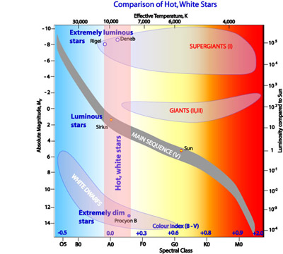
In this case the supergiants Rigel and Deneb have the same effective temperature as Sirius but have extremely high luminosities. They have large radii than Sirius hence greater surface areas and higher luminosities. Sirius is a main sequence star but because it is hotter than the red main sequence Barnard's Star it is much more luminous than it. If you follow the pink band for hot stars down to the bottom of the H-R diagram you will notice that it intersects another group of stars that includes Procyon B. These are the white dwarfs. They are very hot (about 10,000 K or hotter) therefore emit a lot of energy per second for each square metre of their surface. The fact that they are so dim however, means that they must be extremely small and have a very low surface area. The terminology of white dwarf must not be confused with the old-fashioned term of dwarf stars that was applied to main sequence stars. White dwarfs are very different objects to main sequence stars as we shall see in a later page. Technically they have a luminosity class of wd. Simple calculations provide a size for white dwarfs roughly that of our Earth, less than 1/100 that of the Sun.
If we compare the dimmest stars on the H-R diagram we can also make some inferences. The following diagram shows the lower region of the H-R diagram.
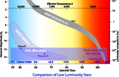
Procyon B and Barnard's Star share the same low luminosity with an absolute magnitude of about +13. Procyon B however is much hotter than Barnard's Star thus emits much more energy per second per unit surface area. Given that they have the same total power output Procyon B must therefore have less surface area than Barnard's Star, that is its radius is smaller.
Axes on the H-R Diagram
This points to an interesting and sometimes confusing feature of the H-R diagram - the scales on the axes. Unlike the height/mass plot earlier in this section, the effective temperature does not increase as it goes from left to right, it actually decreases, that is the highest temperature is on the left-hand side. If colour index (B-V) rather than effective temperature is used then it goes from negative (blue) on the left to positive (red) on the right. A third alternative along the horizontal axis is to use spectral class. Of course, all three quantities are essentially showing the same thing. The diagram below shows the possible axes for an H-R diagram.
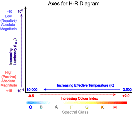
The vertical axis displays the luminosity of the stars. This is either as a ratio compared with that of the Sun or as absolute magnitude, M. One point to be careful of when using absolute magnitude is to remember that the lower or more negative the absolute magnitude, the more luminous the star. The brightest stars therefore appear at the top of the H-R diagram with the vertical axis having the most negative value of M at the top.
In some circumstances, such as when plotting stars in a specific open or globular cluster, apparent magnitude, m, or V, rather than absolute magnitude may be used. This is valid as all the stars in the cluster are effectively at the same distance away from us hence any differences in apparent magnitude are due to actual difference in luminosity or M. Diagrams where V is plotted against colour index, B-V, are also known as colour-magnitude diagrams.
