Classifying Stars - the Hertzsprung-Russell Diagram
There are a few hundred billion stars in our galaxy, the Milky Way and billions of galaxies in the Universe. One important technique in science is to try and sort or classify things into groups and seek out trends or patterns. Astronomers do this with stars.
So far we have discussed the luminosity and colour or effective temperature of stars. These can be plotted to form what is one of the most useful plots for stellar astronomy, the Hertzsprung-Russell (or H-R) diagram. It is named after the Danish and American astronomers who independently developed versions of the diagram in the early Twentieth Century.
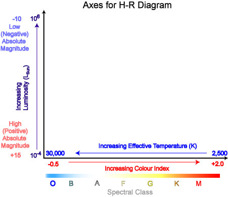
In an H-R diagram the luminosity or energy output of a star is plotted on the vertical axis. This can be expressed as a ratio of the star's luminosity to that of the Sun; L*/Lsun. Astronomers also use the historical concept of magnitude as a measure of a star's luminosity. Absolute magnitude is simply a measure of how bright a star would appear if 10 parsecs distant and thus allows stars to be simply compared. Just to confuse things, the lower or more negative the magnitude, the brighter the star. By definition a star of magnitude 1 is 100 × brighter than one of magnitude 6. Our Sun has an absolute magnitude of + 4.8.

The effective temperature of a star is plotted on the horizontal axis of an H-R diagram . One quirk here is that the temperature is plotted in reverse order, with high temperature (around 30,000 - 40,000 K) on the left and the cooler temperature (around 2,500 K) on the right. In practice astronomers actually measure a quantity called colour index that is simply the difference in the magnitude of a star when measured through two different coloured filters. Stars with a negative colour index are bluish whilst cooler orange or red stars have a positive colour index.
The third possible scale for the horizontal axis is a star's spectral class. By splitting the light from a star through a spectrograph its spectrum can be recorded and analysed. Stars of similar size, temperature, composition and other properties have similar spectra and are classified into the same spectral class. The main spectral classes for stars range from O (the hottest) through B, A, F, G, K and M (coolest). Our Sun is a G-class star. By comparing the spectra of an unknown star with spectra of selected standard reference stars a wealth of information, including its colour or effective temperature can be determined.
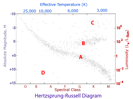
If we now plot a Hertzsprung-Russell diagram for a few thousand nearest or brightest stars we see the following:

As we can see, stars do not appear randomly on the plot but appear to be grouped in four main regions. This is highly significant as it suggests that there may be some relationship between the luminosity and temperature of a star. Whilst not surprising (indeed we have already seen that a hotter star emits more energy per unit surface area than a cooler star) the relationship is complicated by the presence of these four groups. Let us examine these more closely.
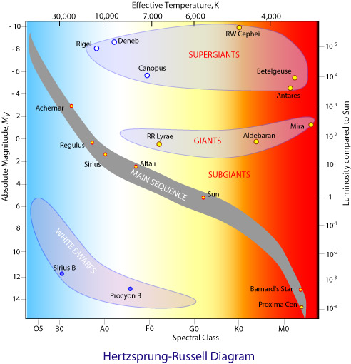
Most stars seem to fall into group A. It shows a general trend from cool, dim stars in the lower right corner up to hot, extremely bright stars in the top left corner which fits in with our expected relationship between temperature and luminosity. This group is called the Main Sequence so stars found on it are main sequence stars. Our Sun is one such example. Others include α Cen, Altair, Sirius, Achernar and Barnard's Star.
Stars in group B are mostly 6,000 K or cooler yet more luminous than main sequence stars of the same temperature. How can this be? The reason is that these stars are much larger than main sequence stars. Although they emit the same amount of energy per square metre as main sequence stars they have have much greater surface area (area ∝ radius2) the total energy emitted is thus much greater. These stars are referred to as giants. Examples include Aldebaran and Mira.
The stars in group C are even more luminous than the giants. These are the supergiants, the largest of stars with extremely high luminosities. A red supergiant such as Betelgeuse would extend beyond the orbit of Jupiter if it replaced the Sun in our solar system.
The final group of interest are those stars in group D. From their position on the H-R diagram we see that they are very hot yet very dim. Although they emit large amounts of energy per square metre they have low luminosity which implies that they must therefore be very small. Group D stars are in fact known as white dwarfs. Sirius B and Procyon B are examples. White dwarfs are much smaller than main sequence stars and are roughly the size of Earth. The diagram below shows the main groups labelled together with example stars in each group.

Having identified the existence of different types of stars based on measurable properties in the next section we will explore some of their characteristics and the sources of energy in the stars.
