Types of Spectra
Spectra can be simplified to one of three basic types. Simple examples in the visible wavebands are shown below.
| Type of Spectrum | Photographic example |
|---|---|
| Continuous (or continuum) |  |
| Absorption (dark line) |  |
| Emission (bright line) |  |
One means by which a continuous spectrum can be produced is by thermal emission from a black body. This is particularly relevant in astronomy and is discussed in the next section. Astronomical spectra can be combination of absorption and emission lines on a continuous background spectrum. Specific examples are discussed on another page.
Black body Radiation
What gives rise to a continuous spectrum? Imagine heating a solid steel sphere with a blowtorch. When you remove the torch you can feel the heat being re-radiated by the sphere. Applying the torch again puts more energy into the sphere – it gets hotter. Eventually it starts to glow dimly. As you continue heating it the sphere glows first red, then orange, yellow then white hot. If you were able to keep heating it sufficiently it may even glow blue hot. This sphere approximates what physicists call a black body.
A black body radiator is a theoretical object that is totally absorbent to all thermal energy that falls on it, thus it does not reflect any light so appears black. As it absorbs energy it heats up and re-radiates the energy as electromagnetic radiation.
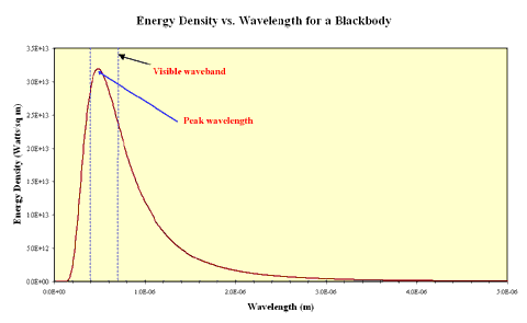
In the real world some objects approximate the behaviour of blackbodies. These must be sources of thermal energy and must be sufficiently opaque that light interacts with the material inside the source. Examples of such objects include the tungsten filaments of incandescent lamps and the cores of stars. The continuous spectrum produced by a black body is distinctive and can be shown as an intensity plot of intensity against emitted wavelength. This plot is called the blackbody curve or the Planck curve, after the German physicist Max Planck who first postulated that electromagnetic radiation was quantised. The plot below shows a Planck curve for an object with a 6,000 K effective temperature, the same temperature as the Sun.
Credit: M. Horrell
Planck curve for a black body at 6,000 K
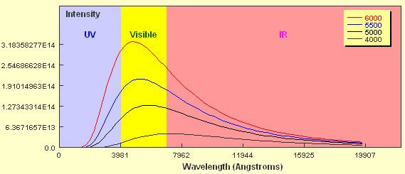
If you look closely at the curve you will notice that the object emits some radiation at every wavelength including in the ultraviolet and infrared wavebands. You should also notice that the amount of energy emitted is not the same for all wavelengths and that in this case, the peak wavelength falls within the region of visible light. Now what happens if the temperature of the black body source is different? The plot below shows Planck curves for an object at four different temperatures from 6,000 K to 4,000 K. Note the wavelength here is expressed in units of Ångstroms. 1 Ångstrom = 0.1 nanometers.
Credit: Plot generated from an applet courtesy of Mike Guidry
Planck curves for black bodies of differing temperatures.
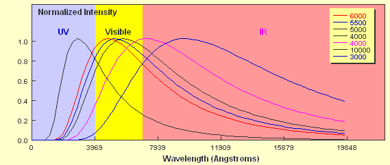
How do the curves compare? Two key points should be apparent. Firstly, a hotter object emits more energy at every wavelength than a cooler one. Secondly, the hotter the object, the shorter the wavelength of the peak of the curve. The 6,000 K object clearly peaks in the visible part of the spectrum whereas the peak of the 4,000 K object borders the visible and the infrared regions. As already mentioned, stars approximate black body objects and can vary in their effective temperatures from around 2,000 K to about 30,000 K. If you tried to plot the intensity of two stars with these extremes on a plot like the one above it would be extremely difficult to show them on the same linear scale. If we just wanted to compare the peak wavelengths we can plot them using a normalised energy output in which the peak wavelength for each corresponds to an intensity = 1.0. This is shown below for six different temperatures.
Credit: Plot generated from an applet courtesy of Mike Guidry
Normalised plots for 6 different black bodies.
You can see clearly from the plot that a 10,000 K star would have its peak wavelength in the ultraviolet part of the em spectrum whilst a 3,000 K star would emit most of its radiation in the infrared part. Not only does the shape of the curve determine the relative intensity of the different components of the continuous spectrum produced by the star, it also determines the colour of the star. A 10,000 K star appears blue-white whilst a 3,000 K star appears red.
Production of Line Spectra
Line spectra appear in two forms, absorption spectra, showing dark lines on a bright background, and emission spectra with bright lines on a dark or black background. These two types are in fact related and arise due to quantum mechanical interactions between electrons orbiting atoms and photons of light. Photons of light each have a specific frequency. The energy of a photon is a function of its frequency and is determined by:
E = hf where f is the frequency of the photon, E is the energy and h is Planck’s constant (= 6.626 x 10⁻³⁴J.s)
An electron orbit a nucleus in a stable energy level. If a photon of a specific frequency interacts with the electron, it can gain sufficient energy to “jump up” one or more levels. The photon is absorbed by the electron so cannot continue on to be detected by an observer. The electron then “de-excites” and jumps back down to a lower energy orbit, emitting a photon of specific frequency. This photon, however, could be emitted in any direction, not just in the same direction as the original incident photon.
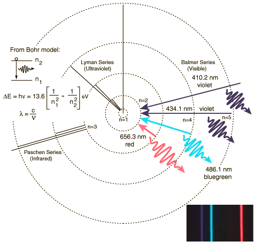
The Balmer series of visible lines for atomic hydrogen are caused by transitions from the n = 2 orbit to and from higher orbits. This is shown schematically in the diagram below for the Bohr model of the atom. The Lyman Series involves transitions down to the n = 1 orbit and involve higher frequency photons in the UV region whilst the Paschen Series (to n = 3) produces IR spectral lines.
Credit:HyperPhysics
Electron transitions in the Bohr model of the Hydrogen atom. As electrons jump down to the n = 2 orbit, they emit photons of specific frequency (hence colour) that can be seen as emission lines in the visible part of the em spectrum. This visible set of lines is called the Balmer series. Click here for an online HyperPhysics applet that allows you to calculate the wavelength and energy of emitted/absorbed photons in transitions.
The Balmer Series for Hydrogen.
| Balmer line | Wavelength (nm) |
|---|---|
| Hα | 656.3 |
| Hβ | 486.1 |
| Hγ | 434.1 |
| Hδ | 410.2 |
| Hε | 397.0 |
The number of spectral lines that can be produced is vast given the permutations of atoms, molecules and orbital transitions possible.
Previous: Historical Introduction to Spectroscopy
Next: Obtaining Spectra